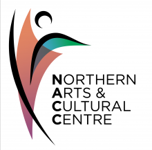
When NACC first started, it was only in Yellowknife and since then has expanded to serve six communities across the Northwest Territories with tours and programming. The new logo encapsulates a broader representation, appeal, and evolution to more significant community evolvement. It’s abstract to let people create their interpretation of what NACC means to them.
It’s modern and contemporary, including Northern colours inspired by the skies. Movement: within the performing arts and nature. Contrast: the north as a place of extremes, diversity, rich in nature, light, dark, and the moon, which pays homage to the previous logo.
It was created in collaboration with Yellowknife based Graphic Designer & Illustrator Lianne Plamondon. You can view more of her work here @ Wild Creative.

